Friday, 23 September 2011

Genre Analysis: Duffy - Rain On Your Parade.

My group for A2 media have decided we'd like to make a music video for the pop-soul genre (artists such as Duffy, Plan B, Adele, Seal, Jamie Cullum etc)...

Duffy's video for 'Rain on Your Parade' is very conventional to the Soul genre. The colour scheme (black/grey/white) is consistent throughout which is a typical colour scheme in itself to the genre which tends not to use bright, garish colours and prefers to give an impression of 'class' and subtlety. These choices in colour may be in place to represent the differences between genres such as chart pop and soul, to show how soul music isn't manufactured and the artists care about music more than image. In most cases, female soul singers appear classy, glamorous and well-dressed however, in this particular video Duffy is dressed moderately provocatively. Despite this, Duffy's state of dress still comes across to the viewer as quite smart, she wears a black blazer and tights and has sex appeal but doesn't look cheap unlike some r'n'b artist, no real inappropriate skin is shown.

In terms of performance, Duffy's role in the video is bold but simple, she sticks to basic but effective dance moves (as shown in the gif image attached below) which is conventional to the genre which doesn't rely on dance moves in music videos and hasn't done even since the real beginning of soul/motown music (as shown by The Supremes in the gif image attached to the right). Instead, Duffy uses male dancers to compliment her own simple dance routine with a more complex one and to avoid viewer fatigue and the technique is effortlessly effective. The dancer's costumes are also smart, the men wear suits and jackets which is again very conventional dress for men in the soul genre including artists and dancers. The male dancer's routine (below) revolves around the main artist and they are seen to be 'falling' around her which suggests her status and importance as an independant and strong woman which is an attitude often adopted by females of the soul genre.


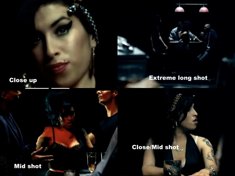
Cinematography is fairly simple throughout, ranging mainly between close ups and long shots which is conventional to music videos (particularly for solo artists) which tend to show the artist performing/singing the song then long full body shots to show dance moves. This is really effective because it presents Duffy as the main focus for the video, which is also portrayed by the fact that she is the only female and that the colour of her legs stand out against the black of the dancer's costumes.  The camera movement depends a lot on tracking the artist, which again conveys her to be the main attraction and connotes her to be a strong woman as everything revolves around her (which is conventional to female artists in the soul genre). The camera movement is very smooth (demonstrated in the above image) and fits in well with the smooth, jazzy feel of the music.

Lighting is key to this video, despite the setting being a plain room, the lighting turns it from dark to light in an instant which creates the idea of changing setting to the viewer and thus avoids fatigue. The lighting is also used to create sillhouettes and at times (again demonstrated above) is used as a vehicle to make Duffy stand out and the dancer's to appear sillhouetted. This is a typical lighting style of the music video, which is a promotional tool and uses lighting to flatter the artist - in order to create sex appeal and sell records. As a viewer, we also see a lot of sillhouetted instrumentists, this is conventional to the soul genre in particular as the instrumentation is key to convey that this genre isn't manufactured and the artist is passionate about music moreso than image, which is more important to pop chart artists.

The editing is also fairly simple which is conventional to a music video which tends to run as a narrative with occasional cuts to performance based shots. However, in the clip above I have included a jump cut which moves from a shot of Duffy central to the frame in a long shot, to a mid shot. Her stance is strong, hands by her sides and legs apart, dominating the frame and the lighting makes her appear a sillhouette. This creates a sense of strength and mystery which again are both conventional to the genre as strong women are prominent in soul as I've previously stated and this eludes to the fact that women in soul tend to be more mysterious than those in pop as they don't so much reveal their personal lives to glossy magazines etc... The shot rotation throughout is fast and fluent to avoid viewer fatigue, although this slows down when the dance routine begins as this allows the viewer to focus.

Thursday, 22 September 2011

Genre Analysis: Amy Winehouse - You Know I'm No Good

This is a short commentary I made on the video, please excuse my voice I had a cold.

Unable to display content. Adobe Flash is required.Amy Winehouse's video for 'You Know I'm No Good' fits some of the conventions for a soul genre video, however much alike herself, certain aspects do contradict the 'norm' in terms of soul music videos but it works as a promotional tool nonetheless.

In terms of lighting, Winehouse's video is really effective and conventional to soul. In the example (below) low key, but highly effective lighting is used on a dark background, reminiscent of a Duffy video, which not only flatters the artist but increases their status and in this case creates an 'eerie' feel. This use of bright lighting on dark background is evident in a lot of soul music videos and could definitely be considered typical of the genre.

In this video Amy is dressed in her typical 'scruffy' style, messy beehive and vest top despite the conventional dress for a female soul singer being usually quite the opposite, dark, smart clothing (such as a black dress). However, Winehouse's own development of fashion earned her recognition as a household name and figure, her sense of style is recognised both world and nationwide. Therefore, although she doesn't really conform to the fashions set by previous soul singers, this helped her to create her own success as an artist and an individual.

The location throughout the video is strikingly similar, although props change around the dark room, such as a bar, a table, a bath, a bed (pictured below). This prop rotation allows the room to take on the shape of a new setting and avoid viewer fatigue.


The colour scheme is dark and revolves around a blue/white/black/grey basis which is highly typical of a soul genre video, particularly in female soul artists. Soul singers tend not to use garish colours and sex-appeal image to sell music but focus more on the message of the music.

Unconventional use of shot types.
Despite the 'lack'of real location change or at least dramatic location change, the video is extremely effective due to it's clever use of cinematography. Winehouse's video is unconventional to the average music video in that a wide variety of shot types are used whereas a music video normally stays around the long shot/close up area, this helps to introduce the viewer to and sell the artist. However, Amy's creative influence in clear in this instance, as is the soul genre, a focus is set more on the message of the song and conveying this in a narrative structure rather than by creating a video revolving around how the artist is important, sexy, etc...
As well as this, a creative, but unconformist decision has been made using cinematography, in that the video uses the highly rare over the shoulder shot in music video format. This is a shot type usually avoided by a music video director as it completely shuts off the artist from the viewer in that their face is not visible, but the back of their head which is often considered a sign of rudeness in day-to-day situations. This would be considered ineffective as the viewer is supposed to engage with the artist in a way that would make them want to buy their music after watching their video. This represents how Amy Winehouse was more interested in her music, than image, or money, fame and beauty (which is further shown in her less than glamorous state of dress) although this isn't typical of a music video this is a trait often portrayed in the soul genre.

Evidence of media and alcohol cultures in the video
The editing throughout on a general basis is typical to a music video structure, moderately fast shot rotation and a mixture between narrative shots and performance based scenes. However, what I found particularly interesting was the way editing is used to show Amy watching her own actions on television and in moving polaroid 'photographs', I found these scenes particularly poignant as they connoted her own struggles with the media and the media insistence on documenting her 'fall from grace' at any given opportunity so all were aware of her personal issues and dramas. As well as this was the dominance of alcohol throughout the video, which I also found intriguing as Amy's creative influence upon the video becomes evident, connotations of her personal battles with alcohol and drug abuse whilst being questioned by a love interest, representing her rocky relationship with husband, Blake for which the whole album 'Back to Black' was based upon add an essence of personality to the video. These connotations show how Amy was passionate about her music, how these lyrics meant something to her and how she wanted to represent this in the video and make it more personal to her - something, maybe not to such extremes, which isn't rare in the soul music genre which is known to focus on music, not image.

Off centre shot, represents her personal state and her unconventionalism

Record Label Analysis


Island records was founded in Jamaica but was based primarily in the UK for many years, now it's owned by the Universal Music Group however now it operates under the Island Def Jam Motown Music Group. This fits well with soul as soul as a genre is derived from Motown which came about in 1960s Detroit, as well as this Def Jam records is well-known for the making of accomplished r'n'b and hip hop artists such as Rihanna - which are also genres of black origin. However, nowadays soul music is equally as dominated by white artists especially in Britain.

Artists such as Leona Lewis, Lionel Richie and most relevant to our genre of female soul, Amy Winehouse are signed to Island Records.


The fact that Island records is related to soul artists means that they're a relevant record company to our planned artist as we wish to base our portfolio around soul music.

Record Label Analysis; by Kayleigh Hobbs

WARNER MUSIC GROUP: is the record label that I have chosen to discuss in this blog post. This is because it best supports the genre of music that I intend to use to create my own music video.
This is the third largest business group and family of record labels in the recording industry, making it one of the big four record companies.
This company was formed in 2004 when it was spun off and made completely seperate from Time Warner.
Some artists that work with Warner Music Group are the likes of: Chaka Khan, Seal, Simply Red and Rod Stewart. This sing in the same style as my choice of artist Duffy.

Warner Music Group is currently situated in New York, United States. This is a very beneficial place to be as there are always new artists looking for recognition in America and being situated in New York would be ideal for the artists to find the record label and want to work with them.

Wednesday, 21 September 2011

Record Label Analysis by Cameron Roberts

Columbia records started up in Washington D.C in 1891, from then to know a lot has changed (believe it or not) and it has since become a very successful record label for soul artists. It is owned by the Japanese company "Sony Entertainment". This is a big label and therefore a lot of very successful artists have been attracted to it because of that.

File:Columbia-logo.jpgI think that this label would suit our music video due to the fact that they sign on a lot of british artists (like Adele for instance) and a lot of artists who fit into the catagory of soul artists (Adele and Beyonce pictured above.) However it is an American label which might make it a bit less relevant to the type of artist that we need to emulate.

Sunday, 18 September 2011

SJA Assessment (SUMMER WORK) 18/09

WWW:
- Again, I have really enjoyed going through your blog and reading your analytical posts Katie. You clearly have a very good grasp of 'genre', and I felt that this really came through in the analysis of both pop and rock videos. I really like the numerous comparisions you make (and your efforts to SHOW rather than 'tell')  with (for example) The Fix and JLS.
- You have clearly taken lots of care taken to compose very good contact sheets - all posts are visual because of the use of contact sheets and You Tube Clips.
- Evidence of meticulous observation, attention to detail and careful thinking and analysis for every post completed as part of the summer work. You write very intelligently about media texts, and use media language very confidently. You clearly gained a lot of useful ideas from the 'In The Sun' class shoot, and I thought the brief video you did with Cameron and Elenya over the Summer was fantastic.
EBI:
- Just some suggestions to consider: The contact sheets are very good Katie, and all screen grabs are relevant to your written comments. It's good to see each post is visual, but try to show a more varied use of media to create visual posts.
- I'd suggest that you try to take short extracts (clips) from some of the music videos you have anaylsed instead of relying on contact sheets for all posts. This would boost marks for 'creativity' and 'skill in the use of media and ICT'. Try creating a 'voice over commentary' perhaps for your analysis of the low budget videos to talk through the ideas you liked and the approaches (lighting / shots) that you felt were successful. If you did this for just one or two of the analytical posts (Pop / Rock or Low Budget) instead of uploading the full 3 min You Tube video - It would really show your ability to analyse editing techniques and camera movement.
- Post 8 - 'Conventions of a Music Video' - missing?
Effort for Summer Work: Very good / Excellent - Once Post 8 is completed - and also, think about the suggestions above. Really push your use of the Blog to it's full potential - voice over commentary and short, relevant extracts are generally much more relevant than whole You Tube Clips.

Thursday, 15 September 2011

Album Advertisement analysis: My Chemical Romance - 'Danger Days: The True Lives of The Fabulous Killjoys'

The advertising campaign for 'Danger Days' revolved solely around the concept for which the album was based. 'The Fabulous Killjoys' are the alter-egos of the band members (and a few new recruits) who are voiced on several tracks on the album and feature in music videos, the album tells the story of the outlaw group 'Fabulous Killjoys' which is made up of these alter-egos fighting against conformist views and 'Better Living Industries' in 2016. It is said that the predicted doomsday of 2012 is the reason for the catastrophic events relayed in the videos, My Chemical Romance have gone as far as to develop a website for 'Better Living Industries' as part of their advertising campaign which sells merchandise and provides 'news' on the situation in 2016. The music videos as well as the running theme is highly reminiscent of a comic book, this is very relevant to the band as lead singer Gerard Way is a trained cartoonist and comic book writer. As well as this, Way directed the videos for both album debut 'Na Na Na' and 'Sing' which I found both 'comic-esque' in the formation of the band within the frame, costume and shot composition (a lot of facial close-ups).


The above image is an advert from Kerrang magazine (although this advert was also featured in similar magazines such as NME and Q) which tends to focus on the Rock music genre, particularly Kerrang.

The image features My Chemical Romance frontman Gerard Way in character as alter ego 'Party Poison', which can be identified by his 'Dead Pegasus' jacket which a defining feature of his character and holds relevance to Party Poison's role in 2016 California - where the music videos are set. An identical advert is also used in the promotion featuring each member of the band, I used Gerard Way's example as I found his portrayal of the character and his role as a frontman interesting.

The rough, grey background could represent the basis of the album and the catastrophic situations in 2016 as well as being conventional to the dark alternative/emo rock genre that defines My Chemical Romance, particularly within the media. On a deeper level this could also connote the 'grey areas' in their musical past regarding the 'emo cult' which they sought to leave behind with the album 'Danger Days' which focuses a lot less on matters like death unlike previous album 'The Black Parade' which caused a media stir. The use of low key lighting also represents both of these matters, particularly in terms of fitting in with the album theme. The colours white, blue and red are also prominent in the feature, both are fierce and forceful colours which could be considered patriotic in relation to the USA national flag which may appeal to American fans. Red appears to be a dominant colour featured on Gerard's jacket and most noticeably his hair, the colour red is known to represent passion and could be a connotation of the band's love for their music which would appeal to rock music fans who tend to be more interested in the 'talent' side of the music industry rather than the image and sex-appeal side. Red could also represent blood-shed which relates to the story of the album.

The artist's composition within the frame is central which conveys his importance and status, as both a frontman and a character. Although the framing is a straight mid-shot, the positioning of his dead looking slightly downwards gives the effect of a low angle shot by making him seem more powerful and threatening. This works as a promotional tool because an artist is supposed to be an aspirational figure for fans or in some cases possibly a figure of attraction to some, so by making Way appear strong this is influential on a viewer's perception of the artist and therefore the music which is being sold. His body language is solid, his shoulders are raised, broad and his arms/chest are tensed which conveys masculinity, this could be applicable to being an aspirational figure or portraying Gerard Way as a symbol for attraction, in general Gerard is perceived to be the 'good-looking' member of the band by fans so this would appeal to fans and work as an advertisement for this reason. His facial expression is serious which indicates status as well as seriousness about music and his portrayal of the character 'Party Poison'.

The bold, capital font is conventional to the genre as it anchors the photograph and comes across as firm and mighty, the kind of idea which is often portrayed by rock music advertisements. The rock genre isn't supposed to come across as timid and feminine unlike pop, so this bright white, 'standout' font is really typical to the genre and works really well to promote the album as the whole image is really effective.


Above is the video version of the advertising campaign which I also analysed, each of the videos use the same publicity shots as the magazine campaign alongside previews of the album (snippets of the songs). These short videos help to introduce the characters and album theme. I personally thought that these videos work even better as a promotional tool than the magazine advertising campaign; the short song previews and overall simplicity of the video would leave fans with questions and excitement that could only be answered or settled by buying the album. The fact that not a lot is given away, but enough to generate curiosity, is really effective in creating 'hype' for the album and theories from unanswered questions - which of course would lead to a fan being really motivated to buy the album. Below are a collage of screenshots I took from each promotional video showing each character with a 'caption', I think these captions too are a really fantastic and effective way to make fans wonder 'what does this mean?' and like previously stated, generate curiosity that can only be settled by purchasing the album (at which point the fan would find out the majority of these captions are from the 'Look Alive Sunshine' monologue featured in Danger Days' debut single 'Na Na Na' which MCR uses as a vehicle to tell the story of the 'Fabulous Killjoys').


All in all, I think that the advertising campaign for 'Danger Days: The True Lives of The Fabulous Killjoys' is incredibly effective in creating 'hype' for the new release as well as being conventional to the rock genre and advertisements in general (for example, the date of release is bold and focused).

Wednesday, 14 September 2011

Album Advertisement analysis: Foo Fighters by Cameron Roberts

Album Advertisement analysis: The Kooks by KAYLEIGH HOBBS

<div class="separator" style="border-bottom: medium none; border-left: medium none; border-right: medium none; border-top: medium none; clear: both; text-align: center;">
<a href="https://blogger.googleusercontent.com/img/b/R29vZ2xl/AVvXsEjLOP26jMxEG8coiaUtPftn4ZFR6gXmFATLvc6uZ1SJnzOV8w3yRIqv5E2vpw7663ZM6QWc8na6M51IbYHadKoz9BqmfAKjKODhQTArXlpkj7tdbmQk8WqYocY5H_zCRVveVJr_efx5bgW7/s1600/DSC00238.jpg" imageanchor="1" style="margin-left: 1em; margin-right: 1em;"><img border="0" height="320" rba="true" src="https://blogger.googleusercontent.com/img/b/R29vZ2xl/AVvXsEjLOP26jMxEG8coiaUtPftn4ZFR6gXmFATLvc6uZ1SJnzOV8w3yRIqv5E2vpw7663ZM6QWc8na6M51IbYHadKoz9BqmfAKjKODhQTArXlpkj7tdbmQk8WqYocY5H_zCRVveVJr_efx5bgW7/s320/DSC00238.jpg" style="cursor: move;" unselectable="on" width="240" /></a></div>
<img height="96" src="https://blogger.googleusercontent.com/img/b/R29vZ2xl/AVvXsEjLOP26jMxEG8coiaUtPftn4ZFR6gXmFATLvc6uZ1SJnzOV8w3yRIqv5E2vpw7663ZM6QWc8na6M51IbYHadKoz9BqmfAKjKODhQTArXlpkj7tdbmQk8WqYocY5H_zCRVveVJr_efx5bgW7/s320/DSC00238.jpg" style="filter: alpha(opacity=30); left: 373px; mozopacity: 0.3; opacity: 0.3; position: absolute; top: 44px; visibility: hidden;" width="72" />This is an advert for the album cover The Kooks- Junk of The Heart. It has just been released.

The Kooks are a band that fit into the Indie Genre of music. This album artwork could be described as simple as there is one main image just off centre. This means that the audience that will be focusing on this album cover, can directly focus on the individual image. It is also a simple image, of a woman&nbsp;standing in a car so it is more than likely going to be remembered by their fans and readers of the magazine.
The font on the cover is in block capitals and in white letters which means that the font is easily seen and will be spotted. The dress that the woman is wearing matches the writing on the album cover so the colours all blend well together.

The costume that the individual is wearing, is an everyday dress that the majority of females would wear. The contrast of the black cardigan against the white dress, could be reflected by the type of people that may listen to the band.
The orange in the corner of the page, matches the ginger hair of the female in the image. All their colours match meaning that no particular part of the album stands out.

Tuesday, 13 September 2011

CD Cover Analysis by CAMERON ROBERTS

CD Cover Analysis by KAYLEIGH HOBBS

Maroon 5- It Won't Be Soon Before Long.

CD Cover Analysis

Genre: Soul Music mood board


I put together a mood board made up of publicity and performance photographs of artists from our chosen genre, soul. These artists are established and largely successful within the genre, these include Paloma Faith, Amy Winehouse, Duffy, Plan B and Seal.

The majority of these artists like to be shown as serious and powerful rather than 'sexy'. In particular, Amy Winehouse and Adele stand out in their image as they're both known for having a brand image unconventional to the music industry itself. Amy Winehouse's instantly recognisable grungy, 'scruffy' style made her an international hit, however it differs greatly from the typical image of a chart topping star - preened and pefected. Adele has also been in the centre of controversy due to her weight and the fact that she is larger than the usual stick-thin pop artists we are used to seeing on the screen. Adele's image has earned her a lot of respect and fans from the public and has contributed greatly to her development of a brand image and making her a recognisable figure both nationally and internationally. 

Thursday, 8 September 2011

Lip Synch Task


During the summer we (Cameron, Elenya and myself) made a video of us lip synching to Junior Senior's 'Move Your Feet' using a variety of locations as practice for making our final music video in A2 Media Studies.

We produced, filmed and edited the video within a very short time frame of three hours therefore mise en scene practices such as mise-en-scene weren't highly thought of in great detail. However, we paid close attention to location - ensuring that we used a variety to avoid viewer fatigue - as well as lighting.

Despite our editing time limit, we managed to successfully match our lip syncing to the soundtrack by using the technique of filming the whole song in each location to make for easy cutting and editing as well as using other FinalCut effects such as speed adjustment during editing to aid the avoidance of viewer fatigue.

Low Budget Idea 2

The Fix - Just Got Paid


This low budget idea is particularly effective in creating a professional feel and linking perfectly to the conventions of the 'boyband' pop genre.

Both the smart suit costume and casual, fashionable costume changes are conventional as they would appeal to females and would make the boys attractive to their female fans - the main target audience for boy bands. The change in costume also counteracts viewer fatigue and minor details such as hair styling and smiling throughout also links into the genre and conventions.

The three locations also help to avoid viewer fatigue as the placement of the band is consistently switching. The lit 'studio' scenery (as seen in screenshot 1) is highly reminiscent of British boyband JLS' video for debut single 'Beat Again' and therefore a conventional influence to this low budget idea becomes evident (pictured below).

JLS video, similar to location/lighting setup to The Fix-Just Got Paid

The cinematography is fairly simple, some slight camera movement and shots mostly interchanging between long shots (for dance moves) and close ups (to see the members of the band) which is very typical of the pop genre. The editing is very precise and in-time with the sound, again this pristine, perfect cutting is related to the genre whereas a rock video is more likely to be more decidedly 'rough around the edges' as an artistic choice.

As a video, this low budget idea is highly impressive and professional looking. The video's attention to detail and convention makes it particularly effective.

Low Budget Idea 1

The Maccabees - X-Ray


The use of stop motion instantly makes the video edgy and fun to watch - thus fitting in with the alternative rock music genre (a style of music which depends on uniqueness and edginess). However, despite being conventional to the genre the stylistic nature of the video comes across as quite amateur, although this is the general effect of stop motion animation, the lighting further adds to this as well as the stop-start nature of the paint scene (picture 4 & 5). Although this stop-start technique was clearly a stylistic choice by the editors and producers of the video, it conveys an unprofessional and amateur feel.

Changes in location throughout avoids viewer fatigue, however there aren't any costume changes and the colour scheme remains dominantly black/white/grey throughout. Further to this, conventionally in a rock music video the viewer would be introduced to and see the band/artist performing the song which isn't seen in this example.

All in all,the video is very effective, enjoyable to the viewer and conventional to the genre, apart from the lack of band related shots.