
I uploaded the first draft of our digipack images to social networking website, Facebook, as it is the perfect outlet to show our work to a large number of people within our target audience.
We aimed to gather both positive and negative comments on our work and use this feedback to develop our work.
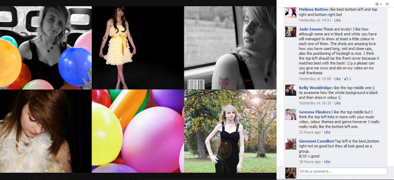
From our feedback on this occasion we found that people liked our use of colour with black and white and that the image in the top left was popular as it fits in well with our genre. However we also used the fact that some of the images (mainly the ones without balloons) weren't so well received as a basis to build a new photoshoot and digipack cover, which led to the change in image which is seen in our final digipack.

This is our second draft digipack. Based upon audience feedback within our class and from teachers we found that all of the images were very well received and our digipack had improved profoundly since the first draft. The audience liked the contrast between the inside and outside images but also how they were all bound together by the use of black and white and colour together. However, our feedback also told us that people felt the centre digipack fold image of our artist's eye was considered perhaps a more effective front cover image than the one we had chosen. As a group we discussed this and chose to go with the 'enigmatic' eye image as our front cover instead, we felt the image had more mystery and intrigue for the audience which is an effective tool for sales.
Feedback


No comments:
Post a Comment