Friday, 4 May 2012
Final Music Video: 'Technicolour' by Veronica Summer. Katie Lee (5117) Kayleigh Hobbs (5093) Cameron Roberts (5170)
This is our final draft of 'Technicolour' by Veronica Summer.
When playing the video pressing the red speech bubble button will remove tags.
Tuesday, 1 May 2012

Wednesday, 25 April 2012

Saturday, 21 April 2012
How effective is the combination of your main product and ancillary texts?
The animoto video I made (above) combines shots from my music video and ancillary tasks. Although there are costume changes and location changes, the brand identity throughout is strong and this is what links my main product and ancillary texts together. The brand identity is shown through rose iconography which remains relevant throughout in costume. The costume also remains dark throughout (apart from the rose dress, which still links as it has a rose print). Hair colour changes but keeps the same big style which links in with the genre and altogether through colour scheme (black/white/red)the combination becomes a package. Most importantly, the tattoos are a huge icon in my main product and ancillary texts and they remain the same throughout the packages so this is a really strong brand identity link which makes our combination effective.
Friday, 20 April 2012
How effective is the combination of your main product and ancillary texts?
I made a slideshow to show how I used costume, location and cinematography to combine the main product and ancillary texts to become one interrelated package which would be easily recognised by our target audience.
Sum
Sum
Thursday, 19 April 2012
In what ways does your media product use, develop or challenge forms and conventions of real media products?
General Conventions of Pop Music and Our Music
 We chose to use a stage scene, similar to that used in Duffy's 'Mercy' as it shows our artist 'in action' and as a real performer which is important to the soul genre. However, we decided to have our artist, Veronica Summer, on the same stage as the band, unlike Duffy. We made this decision because we wanted to show a friendship between our artist and her band, this makes our character likeable and shows how music is important - rather than just being an individual with individual aims. But we did decide to use the long shot which gives the viewer the feeling of watching the band and artist live themselves and creates an overall grandeur of the artist as she stands taller with more status due to the low angle shot. We chose to use bright lighting too but in not such an overbearing way as in Duffy's video as we still wanted our band to be visible as they are part of our genre conventions according to audience feedback(soul = men in black suits).

The bar scene in our video was again inspired by another female soul artist, Amy Winehouse's video for 'You Know I'm No Good'. We decided to go for the same concept, however did local research into finding a brighter bar which fitted our artist and song more appropriately. But we emulated the same positioning of our artist within the frame and the same cinematography of a mid-shot.

Our taxi location was heavily influenced by Duffy's 'Warwick Avenue', we chose to emulate the location similarly however we looked to challenging the convention to create something very similar but with a different feeling attached. We chose to enhance colour in final cut and used balloons as props, we also used both mid and close ups similarly to Duffy but positioned our artist to come across happy and bright - much unlike Duffy. The balloons worked in the same way, to come across bubbly and with happy characteristics, inspired by Paloma Faith.

We used Adele's 'Chasing pavements' as our main inspiration for our outdoor sequences, however rather than just mid-shots we used a variety of close ups, mids and long shots. We wanted to show our artist in a more glamorous light than Adele but still continued to emulate the solemn idea that is put across.
Genre Specific Conventions:


The bar scene in our video was again inspired by another female soul artist, Amy Winehouse's video for 'You Know I'm No Good'. We decided to go for the same concept, however did local research into finding a brighter bar which fitted our artist and song more appropriately. But we emulated the same positioning of our artist within the frame and the same cinematography of a mid-shot.

Our taxi location was heavily influenced by Duffy's 'Warwick Avenue', we chose to emulate the location similarly however we looked to challenging the convention to create something very similar but with a different feeling attached. We chose to enhance colour in final cut and used balloons as props, we also used both mid and close ups similarly to Duffy but positioned our artist to come across happy and bright - much unlike Duffy. The balloons worked in the same way, to come across bubbly and with happy characteristics, inspired by Paloma Faith.

We used Adele's 'Chasing pavements' as our main inspiration for our outdoor sequences, however rather than just mid-shots we used a variety of close ups, mids and long shots. We wanted to show our artist in a more glamorous light than Adele but still continued to emulate the solemn idea that is put across.
Wednesday, 18 April 2012
In what ways does your media product use, develop or challenge forms and conventions of real media products?
THIS IS OUR 2ND DRAFT WORK:
digipack inspirations

This is my 2nd draft advertisement.
I later decided upon audience feedback to challenge forms and conventions by using a different image of just Veronica's eye and a rose with minimal text as the advert as this put across an 'enigma'. I felt that the image was more eye catching and interesting, as well as more likely to draw a customer in through its air of mystery rather than laying everything about the artist out on a page.
 In my final draft advert I decided to both use and challenge the forms and conventions of our genre. I chose, based on audience feedback, to use this image instead - people felt it had more enigma and interest attached. This image actually challenges genre because normally the whole artist's face is introduced, instead I wanted Veronica to come across as somewhat mysterious and to generate sales through audience intrigue rather than sexualisation, image etc. I did however, decide to stick with genre conventional brand identity with the iconography of the rose and the red/white/black predominant colour scheme. I did also use alongside this a multicoloured font for the single name 'Technicolour' which matches the technicolour eye effect I produced on photoshop. Although multicolour isn't a general soul genre convention I felt that the colours gave an essence of fun to our artist which would also intrigue the audience.
 In the digipack, we also decided to use the eye image as our front cover for the same reason I decided to also use it for my advert - a sense of enigma, fun and intrigue. Our final digipack does meet some conventions of the genre - iconography, close ups of the artist and red/white/black colour schemes although we also used multicolour in this ancillary text to put across an element of fun and challenging of general genre conventions.
digipack inspirations

This is my 2nd draft advertisement.
I later decided upon audience feedback to challenge forms and conventions by using a different image of just Veronica's eye and a rose with minimal text as the advert as this put across an 'enigma'. I felt that the image was more eye catching and interesting, as well as more likely to draw a customer in through its air of mystery rather than laying everything about the artist out on a page.
FINAL DRAFT WORK:
In what ways does your media product use, develop or challenge forms and conventions of real media products?
We made this video to show how we used make up and costume to shape meaning and genre in our music video. In this example, our main influence was Amy Winehouse with our use of dark make up, dark clothing, big hair and similar tattoos.
We also used artists such as Duffy and Paloma Faith as inspiration for mise-en-scene in terms of make up and costume. In the Glogster poster below I used images of Paloma Faith which inspired our choices in make up and costume, as well as Winehouse and how...
The image below shows how we also used female soul artist Duffy as an inspiration, we were influenced by her style, particularly in hair to put across a more traditional soul style alongside our more wacky costumes.

Thursday, 5 April 2012
How did you use media technologies in the construction and research, planning and evaluation stages?
In the above video I made a commentary on the main creative points of our video and how we used media technology in these parts. We used media technology throughout our video, every colour clip throughout has been enhanced using brightness and contrast and the black and white clips have been adapted to be colourless in the same way.
Sunday, 1 April 2012
How did you use media technologies in the construction and research, planning and evaluation stages?
The below video is a commentary explaining how we used Final Cut when editing our music video
In the construction of our Music Video 'Technicolour' we used editing software Final Cut Express. We used Final Cut to put our music video together, interweaving all of our shots with continuity in lip synching despite changes in background, costume and other mise en scene. We also used Final Cut to edit our shots to fit our genre (for example, the opening sequence is traditional Soul black and white) and then to enhance the vibrancy of colour of the rest of our shots using brightness and contrast. This was helpful because our designated day to film outdoors shots had turned out to be really dreary so editing our shots allowed us to create a warm, autumn feel.
In the construction of our Music Video 'Technicolour' we used editing software Final Cut Express. We used Final Cut to put our music video together, interweaving all of our shots with continuity in lip synching despite changes in background, costume and other mise en scene. We also used Final Cut to edit our shots to fit our genre (for example, the opening sequence is traditional Soul black and white) and then to enhance the vibrancy of colour of the rest of our shots using brightness and contrast. This was helpful because our designated day to film outdoors shots had turned out to be really dreary so editing our shots allowed us to create a warm, autumn feel.
How did you use media technologies in the construction and research, planning and evaluation stages?
This is an overview of the technologies I used during the research, planning and evaluation stages of A2 Media and how they contributed to my work: mediatech[1]
How did you use media technologies in the construction and research, planning and evaluation stages?


Friday, 23 March 2012
What have you learned from your audience feedback?
We gathered a focus group of our target audience to attend a screening of our second draft Music Video to 'Technicolour'. Here they were filmed watching the video and making comments on what they thought went well and what they thought didn't really work, they were asked also to fill in a survey following this as a basis for both qualitative and quantitative data which we could interpret and analyse.
Following this we asked our 20 viewers to fill out a survey on Survey Monkey which we could use to evaluate our video and to know for our final draft, what we could improve on.
 The above graph is an interpretation of the results drawn from 'What was your favourite location in the music video?' with the majority voting for the stage scenes. On further questioning we found in most cases that this was due to Mise-en-scene and people liked the way the costume and location fitted together in a way similar to the style of Amy Winehouse. Upon this we decided to film more scenes of our artist, Veronica, in this costume.
 Most felt that our video did meet the conventions of the pop-soul genre. Comments from the 3 that said otherwise mainly revolved around seeing more of the black and red costume seen in the stage scenes, as they are Winehouse-esque and these parts best fit the genre. We used this feedback to decide to have another video shoot in the same costume but in another location which would be edited into our final draft video.

Most said that our artist was similar to Amy Winehouse and Paloma Faith, many commenting that our artist was mainly a hybrid between the two in terms of attitude and costume, with some references to Duffy (the taxi location and hair styling). Upon further questioning, the target audience said this was effective because it met the conventions of genre but also introduced something different and interesting.
Following this we asked our 20 viewers to fill out a survey on Survey Monkey which we could use to evaluate our video and to know for our final draft, what we could improve on.


Most said that our artist was similar to Amy Winehouse and Paloma Faith, many commenting that our artist was mainly a hybrid between the two in terms of attitude and costume, with some references to Duffy (the taxi location and hair styling). Upon further questioning, the target audience said this was effective because it met the conventions of genre but also introduced something different and interesting.
Thursday, 22 March 2012
What have you learned from your audience feedback?

I uploaded the first draft of our digipack images to social networking website, Facebook, as it is the perfect outlet to show our work to a large number of people within our target audience.
We aimed to gather both positive and negative comments on our work and use this feedback to develop our work.
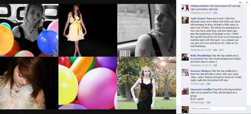
From our feedback on this occasion we found that people liked our use of colour with black and white and that the image in the top left was popular as it fits in well with our genre. However we also used the fact that some of the images (mainly the ones without balloons) weren't so well received as a basis to build a new photoshoot and digipack cover, which led to the change in image which is seen in our final digipack.

Feedback
What have you learned from your audience feedback?
We showed the first draft of our music video (as it was at that point) to our class and asked them to give comments on what they thought we did well on and what aspects of our video need to be improved. This was our first real collection of wide audience feedback and so we decided to film the screening taking place, which is the video above.
From this we found that our audience liked our use of location, Kayleigh's performance and colour. However, our audience also commented on the length of opening shots and from this we decided to increase shot rotation to avoid viewer fatigue. It was also said that we needed more close ups of our artist to create a brand identity and allow the audience to recognise and identify with her. With this information we used Final Cut artificial zooms and camera movements to create the effect of a close up as well as filming more shots in a new location using more close ups.
The most important information we took away from this was the comments on shot rotation and we ensured during our next shooting that we looked at what we had collected as audience feedback so that we knew when we came back to editing that we had used the feedback in such a way to improve our work.
What have you learned from your audience feedback?
A classmate filled out this sheet as a form of feedback on our first draft CD Cover ancillary task work, we showed 2 completed slides and 1 uncompleted slides and this was evaluated using mark scheme criteria.
We found from this that although our use of colour and brand identity was so far successful, we needed to focus on completing necessary texts and fonts on our digipak.
In this feedback Nathan noticed an editing error in one of our slides and this allowed us to quickly correct the image using photoshop.

Since we also have collected teacher feedback during our lessons where we have screened our music video and also our ancillary tasks alongside our gradual improvement of our work. This teacher feedback is short and to the point so allows us to adapt and shape our music video/ancillary tasks whilst receiving feedback. This was really helpful to my group and I because it meant we received precise criticisms which we could work on straight away, for example, if a shot in our music video was said to be too long we could work on final cut there and then to correct it.
Thursday, 23 February 2012


Monday, 16 January 2012
Evaluation draft assessment / Check SJA 16/01/12
Assessment / Check - Evaluation draft ideas SJA 16th Jan 2012
www:
www:
- Good to see you taking our advice on board and thinking of really creative ways to present your info for each Eval question
- Thoughtful ideas noted here - with good intentions to really invest time and effort and use ICT creatively
- Great ideas about comparing the imagery used by Duffy to your own artist
ebi:
- Time to start getting on with developing your 'ideas' and notes into detail Katie, as you have set yourself lots of time consuming tasks to do - but PLEASE do them, as it will be worth it. Have you considered developing a website? or are you going to stick with the really great work you have been doing on your blog to date?
- New Technologies post - try using JING software to 'show' your skilled use of a wide range of new technologies on a daily basis in media lessons - just talk through as you open up your blog, final cut, photoshop, etc, etc... An effective way of showing your skills with new media technologies
- Audience feedback - time consuming - but worth it. Do loads of 'documenting / evidencing' of you seeking a range of opinions from audience, and how you respond to their suggestions. Have copies of 'before' and 'after' edits of your video and photoshop work. The audience feedback needs to be real and genuine for it to work.
- Forms & Conventions Q- I think I saw you were thinking of uploading a Scribd doc for this post?? What about doing a vice over commentary of your music video (or a YouTube tagged version) to SHOW what conventions you were using (lighting, set, shot framing, artist representation, etc....) Don't forget to work towards your A-A* grade by reminding yourself of the 3 music video theories you studied Katie - SHOW an examiner where these ideas are used in your own work.
- Combination of video & ancillary tasks - this is all about the idea of 'design elements' threading through your prac work - show your brand identity and how it comes through your music video and your photoshop work.... Have another look at the Coldplay website / music video / CD cover to remind yourself of the power of an 'identity' combining all promotional material
Overall, great ideasKatie - BUT NOW is certainly the time to get starting on getting these developed...
Saturday, 14 January 2012
In what ways does your media product use,
develop or challenge forms and conventions of real media products?
- Compare our taxi scenes to those used within the same genre, Duffy – Warwick Avenue. Show how we used the same back of a taxi concept but challenged conventions by changing the ‘sad’ perception to something colourful and happy. For this create a short film clip of Duffy’s taxi scene and our own one. Perhaps a voiceover commentary for this.
- Digipak can also be compared to Duffy’s ‘Rockferry’ album cover in that its black and white however, the inside of ours will be colourful which can be compared to Paloma Faith. Challenged conventions by including traits of both type. Could be shown through a video or scribd.
- Also show how we used all 3 approaches to soul music videos, stage (Duffy), colourful (Paloma Faith) and outdoors (Adele).
How effective is the combination of your main
product and ancillary texts?
- Same mixture of B&W with bright colours (turned up by contrast and brightness).
- Comparison of balloons in the video and inside the digipak, could be shown by scribd or imovie.
- Images of our artist compared with composition of other photographs of Amy Winehouse (outdoor images), Duffy (black and white & taxi images) and Paloma Faith (colourful images).
- Images of the ancillary texts compared to clips or screenshots of the video.
What have you
learned from your audience feedback?
·
Create
a film showing audience watching our film then reporting back their ideas for
improvements and what they liked about the video.
·
Could
perhaps send out a copy of ancillary text images with a survey monkey
questionnaire attached asking for feedback and could post interpreted data
gathered from the questionnaire on to our blog and maybe create a commentary
explaining what the feedback means to us in terms of improvements.
·
Afterwards
could create a comparison video based around the changes and improvements we
made to our work based on the feedback we received from the audience. (e.g, if
feedback was that a part of our video needed to look brighter, we could show
the clip of the video before and after we’d adjusted brightness and contrast
commentating on why we did this).
How did you use media technologies in the
construction and research, planning and evaluation stages?
- Could use a scribd to show an overall summary of what I used and elaborate on how.
- Show how we used green screen in planning stages but decided not to use it in our own video as it didn’t suit our genre.
- Images and videos of us using the equipment and talking about any issues we overcame and how we used it
Subscribe to:
Posts (Atom)